Jammy: App & DAW Design
Let me show you an example of how my research process works and how I derive my design conclusions based on market analysis and user research.
Role
UX/UI Designer
Industry
DAW & Music
Duration
3 months
Introduction
Author: Volkan Kantar
Date: August 14, 2020
In the dynamic realm of digital musical instruments, user experience (UX) plays a crucial role. This report provides a heuristic analysis of three key competitors: JamStik, Instrument 1, and TriplePlay, focusing on onboarding processes, functionality, and UI design. The analysis is based on three heuristic principles: User Control and Freedom, Consistency and Standards, and Recognition Rather than Recall.
Heuristic Principles Overview
User Control and Freedom
Assessing users' ability to navigate and control the application seamlessly.
Consistency and Standards
Ensuring uniformity in design and functionality across different platforms.
Recognition Rather than Recall
Presenting information to minimize user memory load.

Limitless
With AI, iteration and exploration become seamless, fun, and highly creative.
Accessible
My solutions always consider accessibility and main heuristic principles to ensure the best user experience at all times.


Heuristic Analysis
I am going to conduct my analyses on three main Heuristic principles
Information will be color coded as shown;
🟠User control and Freedom
🔵Consistency and Standards
🟣Recognition rather than recall
While looking at the products from these perspectives I will be comparing
Onboarding/tutorial flows
General Functionality (Fretboard if available)
UI comparison and accessibility.
Powerful Effects
I leverage AI, effects, and dynamic movements to transform any concept into a compelling logo, brand identity, or gamified object.
Onboarding and Tutorials
Strengths: Comprehensive, gamified learning experience.
Weaknesses: Desktop app lacks consistency.

User Interface
Strengths: Consistent across platforms, intuitive navigation.
Weaknesses: None noted.
Functionality
Strengths: Interactive learning tools, real-time visual feedback.
Weaknesses: Desktop app inconsistency.
Onboarding and Tutorials
Strengths: Comprehensive, gamified learning experience.
Weaknesses: Desktop app lacks consistency.

User Interface
Strengths: Consistent across platforms, intuitive navigation.
Weaknesses: None noted.
Functionality
Strengths: Interactive learning tools, real-time visual feedback.
Weaknesses: Desktop app inconsistency.


Design & Layout
After Effects and key-frame animations
- its important to have the fundamentals :)


Icons
Crafting distinctive logos, icons, and UI elements.
While maintaining Solitaire and its various modes, we also aimed to promote other games to enhance our engagement and provide diversity for our players.


Micro Animations
Breath life into your ideas with motion
TriplePlay
Onboarding and Tutorials
Strengths: Basic setup guidance.
Weaknesses: Insufficient onboarding, steep learning curve.
TriplePlay
Onboarding and Tutorials
Strengths: Basic setup guidance.
Weaknesses: Insufficient onboarding, steep learning curve.
Comparative Analysis
JamStik: Best onboarding and consistency across platforms.
Instrument 1: Needs UI modernization and interactive tutorials.
TriplePlay: Must simplify interface and enhance onboarding.
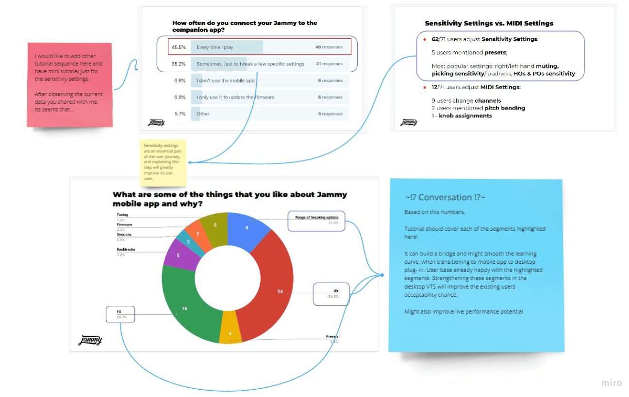
Research Process and Design Conclusions
After analyzing the industry and identifying key competitors, I conducted several meetings with the Jammy team to define our design requirements. Here's a summary of the insights and decisions:
Outdated vs. Functional Design: Competitors often had either outdated but easy-to-use designs or cluttered but functional interfaces.
Lack of Onboarding: None of the competitors provided a proper onboarding experience.
Insufficient Tutorials: Existing tutorials were either non-existent or overly simplistic, offering little guidance.
Poor Plug-In Usability: Competitor plug-ins were hard to use without guidance, relying on trial and error.
Simplicity and Visual Hierarchy: Crucial for a smooth learning curve.
Short Onboarding: Essential to avoid overwhelming users.
I utilized user interviews, screeners, and existing quantitative research to deepen my understanding of our user base. This led to several proposed solutions, including:
Onboarding Flow: Streamlined to ensure users start playing quickly.
Navigational Enhancements: Improved overall app navigation.
Visibility and Accessibility: Upgrades to make the app more user-friendly.
Simple Tutorial Mechanisms: Designed to guide users effectively.
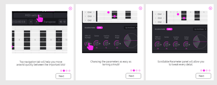
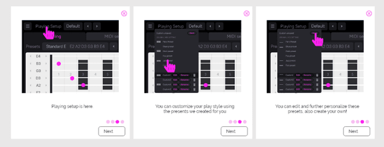
Designing the Product Tour
I began by creating wireframes and user flows to clarify my design direction before moving on to UI design. To ensure accuracy and efficiency, I presented these steps in a meeting with the Jammy team before developing the high-fidelity design.



Learning Points
Establish Early Communication: Initiating communication early and taking notes during kickstart meetings are essential for setting clear expectations and goals.
Understand the Product Thoroughly: Before proposing solutions, it's crucial to learn as much as possible about the product. Working with Jammy taught me not to rush into solutions, even if the client is eager. This approach helps in setting realistic progress timelines, managing time effectively, and aligning deliverable expectations, thereby minimizing communication errors and avoiding unfulfilled expectations that could slow down the process.
"Working on this research project with Jammy has provided valuable insights into the importance of early communication, thorough product understanding, avoiding premature solutions, setting realistic expectations, continuous feedback, and effective time management. These learning points are essential for successful project execution and delivering high-quality results that meet client expectations."
Conclusion
This heuristic analysis underscores the importance of user control, consistency, and ease of recognition in digital musical instruments. By addressing identified gaps and embracing best practices, each product can enhance its user experience and market competitiveness.
Comparative Analysis
JamStik: Best onboarding and consistency across platforms.
Instrument 1: Needs UI modernization and interactive tutorials.
TriplePlay: Must simplify interface and enhance onboarding.

Research Process and Design Conclusions
After analyzing the industry and identifying key competitors, I conducted several meetings with the Jammy team to define our design requirements. Here's a summary of the insights and decisions:
Outdated vs. Functional Design: Competitors often had either outdated but easy-to-use designs or cluttered but functional interfaces.
Lack of Onboarding: None of the competitors provided a proper onboarding experience.
Insufficient Tutorials: Existing tutorials were either non-existent or overly simplistic, offering little guidance.
Poor Plug-In Usability: Competitor plug-ins were hard to use without guidance, relying on trial and error.
Simplicity and Visual Hierarchy: Crucial for a smooth learning curve.
Short Onboarding: Essential to avoid overwhelming users.
I utilized user interviews, screeners, and existing quantitative research to deepen my understanding of our user base. This led to several proposed solutions, including:
Onboarding Flow: Streamlined to ensure users start playing quickly.
Navigational Enhancements: Improved overall app navigation.
Visibility and Accessibility: Upgrades to make the app more user-friendly.
Simple Tutorial Mechanisms: Designed to guide users effectively.
Designing the Product Tour
I began by creating wireframes and user flows to clarify my design direction before moving on to UI design. To ensure accuracy and efficiency, I presented these steps in a meeting with the Jammy team before developing the high-fidelity design.


Learning Points
Establish Early Communication: Initiating communication early and taking notes during kickstart meetings are essential for setting clear expectations and goals.
Understand the Product Thoroughly: Before proposing solutions, it's crucial to learn as much as possible about the product. Working with Jammy taught me not to rush into solutions, even if the client is eager. This approach helps in setting realistic progress timelines, managing time effectively, and aligning deliverable expectations, thereby minimizing communication errors and avoiding unfulfilled expectations that could slow down the process.
"Working on this research project with Jammy has provided valuable insights into the importance of early communication, thorough product understanding, avoiding premature solutions, setting realistic expectations, continuous feedback, and effective time management. These learning points are essential for successful project execution and delivering high-quality results that meet client expectations."
Conclusion
This heuristic analysis underscores the importance of user control, consistency, and ease of recognition in digital musical instruments. By addressing identified gaps and embracing best practices, each product can enhance its user experience and market competitiveness.
User Interface
Strengths: Extensive sound production features.
Weaknesses: Cluttered interface, high cognitive load.
Functionality
Strengths: Supports app and sound bank integration.
Weaknesses: Overwhelming interface.


User Interface
Strengths: Extensive sound production features.
Weaknesses: Cluttered interface, high cognitive load.
Functionality
Strengths: Supports app and sound bank integration.
Weaknesses: Overwhelming interface.





OTHER PROJECTS


Microsoft Solitaire Collection
I was initially hired for Microsoft Solitaire, where I worked closely with Kevin Lambert, a seasoned designer with over 25 years of experience in game design and UI. His mentorship greatly enhanced my professional skills.


Badge
Redefining the Job Search Experience - Badge is your all-in-one, AI-powered job search companion on iOS, streamlining the process of building profiles, crafting cover letters, and applying with ease.


SARV
Agile workflows and rapid iteration to create a user-centered solutions, multidisciplinary techniques.
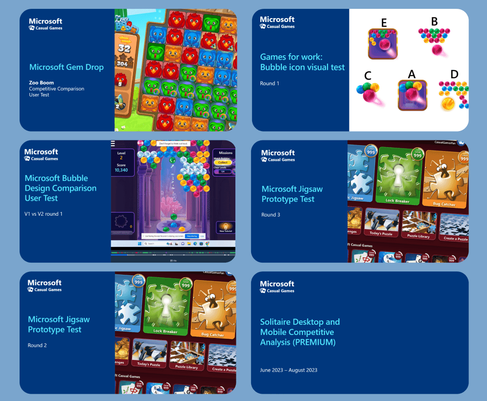


UX Research
Let me explain how I identify problems, conduct research, find and apply solutions.


Motion Design & AI
Motion Designs, Micro Animations AI Explorations, and Playing with Emerging Technologies.